Many vendors claim they have analytics, and a lot of users have embraced the belief that analytics is the way to go. But what does analytics really mean, especially to business users without statistics backgrounds, and how much do they need to know about analytics to be able to make sense of the results?
I would like to start with a quick brain game. The two following charts show historic sales across time. Starting on the vertical line, what we see are forecasted sales numbers. Which of the two forecast charts would you think is more accurate or do you feel is more trustworthy?
-
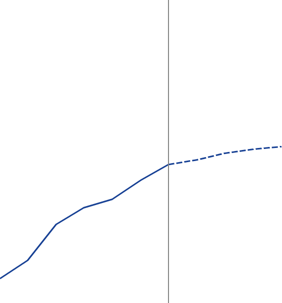
- Figure 1 – Forecast 1 trending up
-
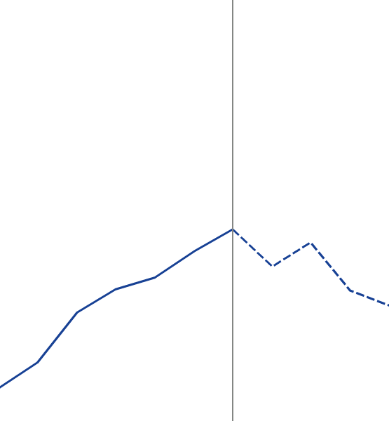
- Figure 2 – Forecast 2 trending down
What if the same two charts are now presented with upper and lower limits that show how confident we are that the forecasted sales numbers fall within the shaded area 95 percent of the time? Which of the two forecast charts do you think is better now?
-
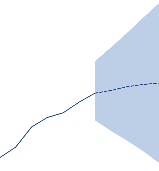
- Figure 3 – Forecast 1 with 95% confidence interval
-
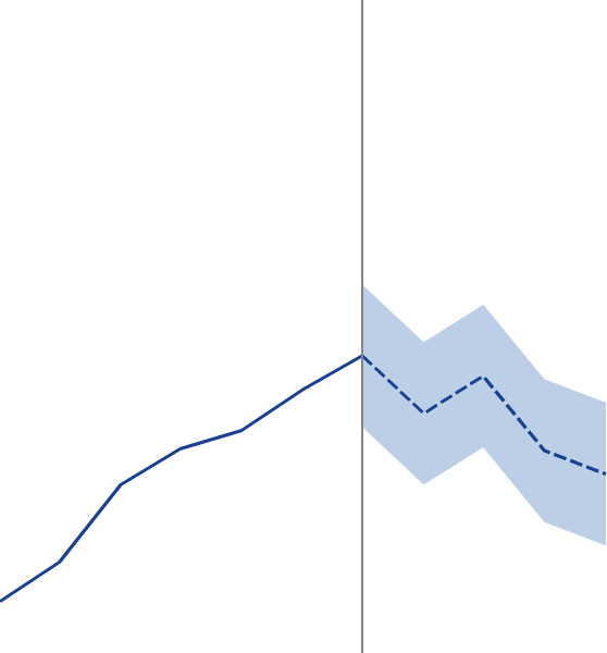
- Figure 4 – Forecast 2 with 95% confidence interval
Yes, we all agree that the error margin in the second forecast is lower and if we had to choose one chart to make a decision, this would be the one. Looking at those two forecasts a little bit closer, the second and more accurate forecast falls totally within the error margin of the first one, which indicates forecast #1 is not wrong, but just not as accurate.
-
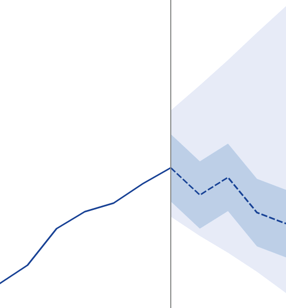
- Figure 5 – Forecast 2 is within the 95% confidence interval of forecast 1
I’m not a statistician, but I have some close friends that are. And they, more than anyone, know that numbers don’t lie, as long as you are not omitting anything. That’s exactly what happened here. The confidence interval is an important piece of information that needs to go along with each and every forecast chart. Without it, we could easily be fooled by the numbers (or the pretty pictures), especially if we are not statisticians.
If you are thinking no one would do this, don’t be so sure. I’ve seen tools in the market that do exactly that: omit important information such as the confidence interval in a forecast chart, maybe because they don’t understand analytics.
Analytics has been proven to be a science that provides value to help make more accurate decisions. The challenge has been around making analytics simple enough that business oriented users, without an analytics background, can benefit from it, while at the same time delivering insights that only analytics can provide. SAS® Visual Analytics was designed with this purpose in mind: democratization of analytics, or bringing analytics to the masses.
Analytics can get very complex, and finding the right balance between ease of use and ability to provide meaningful results without weakening the power of analytics is key. With forecasting, SAS Visual Analytics executes six different models behind the scenes and provides the champion model as the result. Users can then apply the knowledge they have about their business and indicate underlying factors that could affect the forecast. SAS can then recalculate the forecast, taking that information into consideration and using additional algorithms. As a result, the confidence interval can become narrower, indicating the forecast is more accurate. It does all of that through an intuitive interface and communicates results back using easy-to-interpret visualizations. That’s making analytics approachable and actionable.
There is a lot more that could follow from this forecast exploration flow, such as scenario analysis and goal seeking through a what-if approach, but that is a topic for a future discussion.
Do you have analytics? Yes, we have analytics!